Thursday, September 9, 2010

Weeks 1 & 2

This class has already opened up new areas of the art world for me. Being a photographer and not incredibly familiar with the "classical" side of art (other than, "Oh, that painting's lovely!" type analysis), browsing an "abstract" art gallery following the progression of painting from impressionism to abstraction was a pretty new experience. Honestly I thought I wouldn't enjoy it. But I did. Ruth came along and explained the progression by following a "tree motif" through several paintings, and it broadened the learning experience even more.

Frankly, I don't really like abstract art. I think it's weird and sometimes unsettling. I'm a bit of a traditionalist when it comes to that sort of thing. I like a bit more explanation than the modern abstract art gives, and I don't like cubism at all - all the purely geometrical art is just too far on the "analytical" side of art for me. That being said, I gained an appreciation for the complexity of some of the abstract paintings, and realized that they aren't just a bunch of random shapes and colors thrown together. Some of the artists who created the works may have had warped minds, but some of them were brilliant.

Here, for example, is some examples of art from Mondrian:

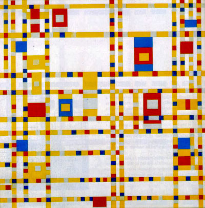
(www.andrewgrahamdixon.com - Mondrian Broadway Boogie Woogie)

This is the last work he did, and this type of geometrical, color-simplistic art is what he is best known for. However, his art was nothing like this in the beginning. He began with this:

(www.theartofmemory.blogspot.com - geinrust farm in watery landscape, 1905-1906)


What lead to this change? How could he go so drastically from the latter to the former? It begins with negative space (or rather negative shapes), verticals, horizontals, and simplicity of color. Mondrian falls into what is called the "analytical" camp of impressionism and then abstraction. This means rather than focusing on the emotional/expressive value of an image, he focused on the geometrical and analytical side. The softness that was in his earlier paintings eventually gave way to harder lines, stronger and stronger horizontals and verticals, black and white with the primary colors only, and an over all minimalist view. Following his tree motif, you see him gradually turn the trees into grids, until there was no tree left in his later works.

Why is this of any importance? Well, first of all, this is a "contemporary issues of design class" (obviously). So it's important to know the influences of contemporary design. Yes, paintings have an impact - a huge one, in fact - on a lot of modern design and even architecture. Take a look at this building, for example, and see if you don't notice the similarity between this and the first Mondrian painting shown:


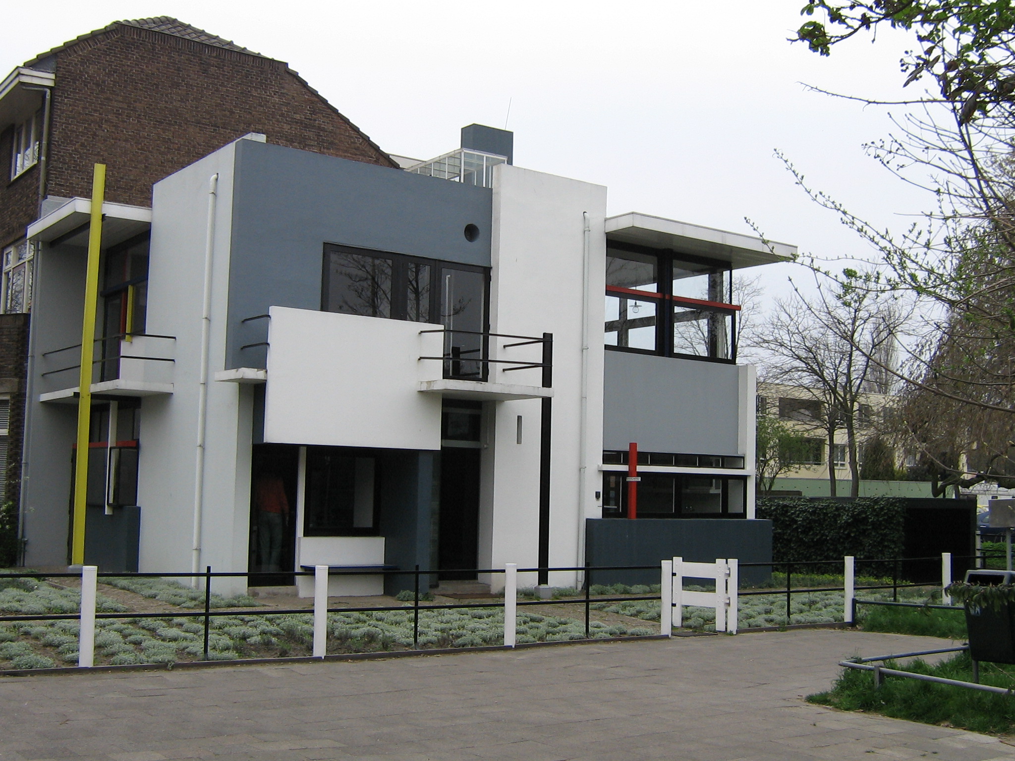
(www.upload.wikimedia.org - Rietveld Schroederhuis)


(www.flickr.com/photos/homehousedesign and Itarkitekter.dk - Modern Harbor Apartments Design)


There are many other buildings that have been influenced by abstraction and the "minimalist" manifesto, being seen by many as "avant garde" (the "cutting edge") of design.


Now to switch gears and move on to talk about the type of paintings that I prefer over the cubism/abstraction paintings. As part of the art gallery visit, we had to choose our favorite artist from the exhibit and do some further research on that person, preparing to discuss that artist in class the next week. By far my favorite painter in the exhibition we visited the first class day was Claude Monet.

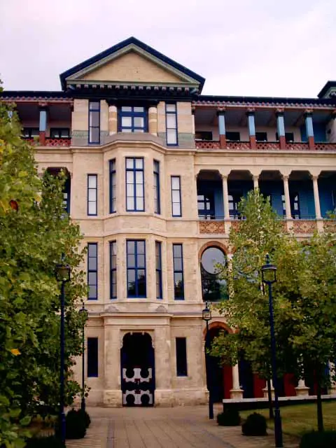
 (www.nga.gov.au, 'Port-Goulphar, Belle Île')

Born in 1840, Oscar Claude Monet began his artistic career selling his charcoal charicatures in Le Havre, Normandy (though he was born in Paris, France). As he watched other artists (painters specifically) he noticed that all they seemed to do was copy the masters and imitate them as closely as possible. He preferred to paint what he saw, often using "en plein air" techniques.He painted to capture the "impression" and emotions of the scene, rather than focusing on the realism of the image he desired to create. Often he would start a painting on the scene, and would finish it later - Another aspect of his work that set him apart from many of his contemporaries was the way in which he used colour. First of all, he let the eye do much of the blending, painting short, small, rapid strokes of different colours side by side rather than mixing them on the palette. Second, over the course of his career he narrowed the colours used in his paintings down to nine - mainly blues, yellows, and reds, and eventually eliminating black and earth-tone browns from his painting palette. His painting titled "Impression, soleil levant" was the catalyst for the term "Impressionism" in the art world, and Monet is often labeled as one of the fathers of Impressionism.


(blog.sciencegeekgirl.com - Claude Monet Impression Soleil Levant 1872)

Week 3/4

Assignment: To bring examples to present of art that was created with the intention of being politically provocative. (Examples below the same ones I showed and explained in class.)


http://warpost.blogsome.com/wp-admin/images/OPTPill.jpg
http://www.puppstheories.com/forum/images/unclesam.jpg
http://farm1.static.flickr.com/241/453272598_f41f024aa1.jpg
http://farm4.static.flickr.com/3222/2778212328_292507b008.jpg
http://newmexicoindependent.com/wp-content/uploads/2008/12/political-activity-art1.jpg

http://i.ehow.com/images/GlobalPhoto/TopicGuides/DS7229/7229-main_Temp1.jpg

http://www.puppstheories.com/forum/images/writewhatyertold.jpg

http://www.sinkers.org/posters/languageofwashington/languageofwashington.jpg


http://art.ngfiles.com/images/28/esn_political-blahs.jpg
Rather than merely a form of personal expression, art and design can be agents for cultural and political change. Some examples from the Spanish Civil War to now include:

- Goya, who used blood/gore as shock factors in his works that were designed to make a political statement

- Daumier, who's work "Third Class Carriage" was obviously created with a political motive, as he wouldn't have made money from so going against the status quo of art subjects.

- John Heartfield, who protested Nazism during the 1960's

-Banksy

Bansky is a prominent artist who bucks the influence of those in political/social power. He is an elusive graffiti artist whose identity is not publicly know, but whose work is widespread and well-recognized. His works include totally unique pieces as well as new and altered renditions of famous works, including Monet's Garden, the "peace" dove, and the famous image of Marilyn Monroe. Here are some examples of his work:

http://www.thecitrusreport.com/wp-content/uploads/2010/04/banksy-again.jpg
http://www.smh.com.au/ffximage/2007/12/04/BanksyImage_wideweb__470x368,0.jpg
http://3rdeyedrops.files.wordpress.com/2010/06/banksy.jpg
http://www.saardrimer.com/pics/banksy_england.jpg
http://oconallstreet.com/wp-content/uploads/2010/02/banksy3.jpg

There are many different kinds of art that can be used for political statements. Photojournalism (brought home what was actually going on in Vietnam), street art, and political cartoons (least aggressive of the persuasive arts - sometimes humorous, sometimes nasty) are a few such art forms.

Thursday, August 5, 2010

Week 5

Today's discussion revolved mainly around two articles directly and indirectly addressing feminism and the role of the image of women in design. The first piece we read and discussed was about Helene Gordon-Lazareff, original creator of the fashion magazine ELLE.
http://ipjblog.com/lapressemagazine/files/2008/05/logo-elle.jpg
According to the article, Helen used to say that women who understand how men look at them will spend all their life "sipping champagne on sunny terraces." The issues surrounding her magazine and those like it include female emancipation, the image of women in a designed piece, content and style, ground-breaking technology (she brought colored photography to the States in her magazine), and Modernism (Swiss). Helen made high-fashion accessible with humour and fun, she herself being extremely confident, especially for 1945. Her upbringing contributed to this - she was very well off and was treated as royalty. Her style of communication was "flirty"; she had a natural charm.

http://ipjblog.com/lapressemagazine/files/2008/05/helene2.jpg

Known as the "tsarina" by her staff, she was adored and respected by all. However, though she rose to prominent power, some of Helen's ideas seemed very non-feminist. During the second World War, women had been brought into the workforce as an emergency more to help with the war effort, and here feminism got a good boost, though it had started much earlier with women's voting rights and such. Helen, however, didn't think women should be fighting for feminism, as she thought they already had a good position in society. She surrounded herself with men "who extolled femininity as defined by men in love with women." It is no surprise, then, that the fashion spreads of her magazine were "upbeat, friendly, youthful, and seductive."

"How to attract and please a man was the driving force behind most of the articles. Keeping house, cooking, sewing, knitting, shopping, and taking care of children were celebrated. And though French people love to argue about politics, the magazine dodged the topic...the coverlines and headlines often asked provocative questions, about everything from abortion to adultery--but the answers were always deeply conservative." - Veronique Vienne
 Her art director, Peter Knapp, helped create the cutting-edge design that seemed quite avant-garde, and she ensured that the men who worked for the magazine were, like Knapp, "a fan of the opposite sex," that they looked at women more than at women's clothing, and would give her magazine the "imprint of a straight man's sensibility." Helene Gordon-Lazareff didn't like anything trivial, cute, or fussy.

http://www.retromag.com/gallery/regular/27233_31495.jpg


http://www.retromag.com/gallery/regular/22151_32261.jpg

It is interesting to note that because of the enormous male interest in the ELLE magazine, French men became fashion connoisseurs, a trend which can still be seen today.

http://www.retromag.com/gallery/regular/22150_32259.jpg
Sadly, the ELLE magazine has strayed far from what it's designer intended. It's current message is not what what it was created to portray. In the words of Frank Horvat, "...most fashion magazines today, including ELLE, are too clever. They give readers the impression that they are not good enough..." This is exactly what Helene did NOT want. In her naturally self-confident way, she felt and conveyed that nothing was impossible. "She sincerely believed that women were equal, if not superior, to men. That's why she wasn't much a of a feminist. She never understood why women wanted to fight for something they already had," said Knapp.

The second article we discussed much more briefly. It covered the topic of related subjects from the perspective of the comic strip 'Dagwood.' According to the author, it is interesting to note that Blondie, the wife and mother in the ongoing story of Dagwood, is of no particular interest to the reader - not because she's a slacker, but because she's so perfect. The interesting character is the father, who is lazy, a bit unintelligent, and childish.  Is this a result of feminism? The downplaying of the male role in the family? It could easily be argued. If so, that sort of feminism is very anti-Biblical.

Week 6

The 80's is Back - Powerhouse Museum visit: Design issues/solutions/comments

  • T.V. shows, sitcoms, etc. such as "Neighbors" addressed issues in family/everyday life and brought people/families together
  • Clothing - coming out of the wars, there were a lot of military and "worker" style design remnants visible, particularly in the early 80's. Clothing also experienced the rise of subcultures - distinctive "badges" of different urban tribes, such as rockabilly and mods, hip hop and goths...
  • Tax incentives encouraged businesses to invest more money into the cinema and television industry, giving Australians a new confidence in the way they presented themselves to the world
  • Personal computer developed in the 80's
  • Colors were very bold - lots of solids and bright shades...possibly affected by the rise of the personal computer and its early limitations in color
  • MUSIC. Perhaps one of the main issues of importance in the 80's. It became as much about the look as the sound. MTV was introduced, and with this people in the music world became highly influential in the political and social arenas, in the fashion world, and more. Many musicians of the 80's branched out and explored the creation surge in styles and sounds. Regarding punk, Jane Dambranskas said, "...it was mostly people just wanting to hang out together and have a laugh."
  • The 80's was a time of "party" society - however, it also was a time of upheaval and extremes, prosperity and recession, soaring salaries and unemployment, threat of war, concern for the environment, etc. Reflections of the 80's are still present - dance party, strobe lights, music styling, design styles...It was interesting to me to note that a lot of the design pieces (particularly posters and such) on display in the exhibit looked like they could easily have been designed within the last 5 years.
  • Dancing continued to be a big part of society in the 80's - particularly in Sydney, which was known as the dance capital of the world.
  • Celebrity fitness programs became popular with spread of television programming and the idolizing of music artists
  • "Must have" items became huge thanks to television advertising
  • AIDS and HIV surfaced in the 80's - Australians led in prevention campaigns
  • Indigenous and non-indigenous Australian came together for land rights in the late 80's
  • "The 1980's cut loose from attempts to perfect a highly controlled modern society and freedom broke out everywhere - particularly the freedom to make a lot of money and spend it all on yourself without guilt. It was the decade of the yuppie and it was the decade of designerism." - Adrian Franklin, "Collecting the 20th Century" 2009

https://blogger.googleusercontent.com/img/b/R29vZ2xl/AVvXsEhMs9_9JeluvHTrunZqLgS3e7neiEbV2J50-_ATl8s4Cnf8iDaTAcV-3qyYdcndmxmp9EMkVGMreyQfG9usAFc1o0sEHCd3mJZMhfE1DXYWKjiCWG_Wg7WJfZrBvGGM9frZAaMdlP_FpFs/s320/whos_the_boss.jpg
http://raveandroll.files.wordpress.com/2009/06/spoons_b.jpg

http://d.yimg.com/ec/image/v1/release/189719067;encoding=jpg;size=300;fallback=defaultImage
http://shutupandblog.com/applications/wp-content/uploads/2010/03/coreys.jpg
 http://www.filmscorefocus.org/uploads/images/back_to_the_future.jpg

http://rockwritelisten.wikispaces.com/file/view/MTV.jpg/31764565/MTV.jpg
http://farm3.static.flickr.com/2287/2190829096_1cf5b26f25_m.jpg
http://fortunebrainstormtech.files.wordpress.com/2008/02/moy.jpg
http://onceuponageek.com/images/star_trek_dc.jpg
http://www.pastemagazine.com/blogs/form_and_function/workman.jpg

Week 7

Today was mostly spent in the giving of presentations, including mine (as I was gone last week for the ASC Outback trip). Here is most of my presentation.

~~~~~~~~~~~~~~~~~~~~~~~~~~~~~~~~~~~~~~~~~~~~~

If you had to guess the second-ranking cause of death in infants, what would you speculate? Sudden Infant Death Syndrome? Pregnancy complications? Uncontrollable birth defects? Actually, none of the above. The answer would be premature and low-weight births.


This issue is one that affects millions of families every year. Not just because of the immediate medical concerns for the premature or low-weight babies, but because of the possible long-term consequences. This and other causes of infant death are of such importance that in 1990 world leaders at the United Nations Millennium Summit pledged to reduce the deaths of children under 5 years of age by two thirds by the year 2015.


Over recent decades, the survival of premature newborns has improved dramatically. For many of these children, their long-term chances are very good, and they develop normally. However, the risk of death and long-term problems begins to increase the more premature their birth or lower their birth weight. These risks are raised exponentially when proper medical care is not available, as is the case in developing countries. In fact, of the 13 million premature babies alone that are born each year, 11 million are born in Africa and Asia - often in areas that don’t have access to modern medicine and technology, including incubators.

In the need for these incubators lies one of the biggest problems. Hypothermia remains among the top challenges for premature and low-weight babies: they are not able to regulate their own body temperature, and therefore cannot stay warm. This occurs for several reasons. First of all, premature newborns have a large skin surface area relative to their weight, so they lose heat rapidly. Also, they have a much lower percentage of body fat, an immature neurological system, fragile skin, and a poor metabolism. The most important thing a baby should be doing in the first month of its life is growing. But because these childrens’ bodies are busy trying to stay warm, they aren’t able to develop properly. The babies’ response to this decreasing body temperature is a slower heart rate, lower blood pressure, heart irregularities, fainting, and eventually death. If the child does survive, some of the long-term consequences may include early diabetes, heart disease, low IQ, cerebral palsy, vision impairment, and many more life-long illnesses. And yet in so many cases these could be prevented simply by helping the babies stay warm.


Incubators do solve this problem.  They provide a warming and safe environment for the premature and low-weight babies that allows them to maintain their body temperature much more easily (a radiant heater sometimes being used for this). They are in wide use in hospitals and clinics. However, incubators have limitations. Namely, they are not portable, they require electricity, and they can cost up to $20,000. Considering that 11 million out of the 13 million premature babies are born in developing countries and often in rural areas, this is not very practical, and incubators are very hard to come by in these places. Because of this, many parents have tried alternatives to help their children survive, including tying hot water bottles to the babies, putting them under artificial lighting, and placing them close to hot coals. None of these options are working ones in the long run, and they are certainly not safe.

What is needed then is a local solution – something that could work without electricity. It needs to be simple enough for a mother or midwife to use, considering the fact that in rural areas most births still take place in the home. It needs to be portable and easily accessible, as well as easily sterilized to be used for multiple babies. And of course it needs to be in a price range that is practical and reasonable for low-income families.
The Embrace Infant Warmer solves these problems. Designer Jane Chen created this solution after a visit to India and an encounter with a woman who had lost her premature baby because she didn’t have the means to get to the nearest hospital in time. A life-saving little blanket that resembles a baby’s sleeping bag is the result.

The secret is in the phase-changing material contained in the heating pouch. It is a wax-like substance that has a melting point of 37 degrees Celsius – human body temperature. It can be melted just by using hot water. Once the material is melted, it can maintain a constant temperature for four to six hours, after which you simply reheat and remelt the pouch. While the heating pouch is warm, it is placed in the back pocket of the Infant Warmer. Here it creates a warm, sustainable microenvironment for the baby. The material is waterproof, and there are no seams on the inside, which allows it to be easily sterilized. No electricity is necessary, and the design is simple and practical, making it something a mother or midwife could feel comfortable using without a doctor’s supervision. And the cost of these warmers is a mere 25 dollars – less than .1% of the cost of an incubator.

The repercussions of this are enormous. The first clinical trial already having been successful, over the next 3 years Embrace claims that by providing affordable and accessible solutions to prevent hypothermia, the Embrace Infant warmer will save the lives of roughly 100,000 babies and prevent lifelong illness in another 800,000. (Embraceglobal.com)


Sources:
www.embraceglobal.org

www.ted.com

http://blog.ted.com

http://dying.about.com/od/pediatriccare/tp/leading_causes_infant_death.htm

http://emedicine.medscape.com/article/979717-overview

http://timesofindia.indiatimes.com/life-style/health-fitness/health/Largest-number-of-premature-babies-born-in-Asia-and-Africa/articleshow/5412579.cms

‘Hypothermia and Your Premature Baby’ by Sjona Lindquist

http://campaign.r20.constantcontact.com/render?llr=dyiggxcab&v=001rBBS2uM5H3_L09Ge1el2aOpbkBwE8zRauwWkz131oysuw8S2c7THSKHPuPuJl-bhXCaK4VLOBnbTw0ppWb1F2pPDUyqp1E_gLirD1PypREw%3D

http://www.merck.com/mmhe/sec23/ch264/ch264c.html

http://www.missionhospitals.org/

~~~~~~~~~~~~~~~~~~~~~~~~~~~~~~~~~~~~~~~~~~~~~

Another thing we discussed in class was Classicism, and the rehashing of Greek and Roman architecture.

Classical architecture elements include "the golden rectangle as a key proportion for buildings, the classical orders of columns, as well as a host of ornament and detail associated with Greek and Roman architecture. They also began reviving plastic arts such as bronze casting for sculpture, and used the classical naturalism as the foundation of drawing, painting and sculpture"  as well as semicircular arches, domes, niches, etc. It places an emphasis on symmetry, proportions, geometry, and "the regularity of parts as they are demonstrated in the architecture of Classical antiquity and in particular, the architecture of Ancient Rome." (wikipedia.com)

Here are some examples of classicist architecture:

http://homeinteriordesign.biz/wp-content/uploads/2009/07/New-Classicism-of-The-Rebirth-of-Traditional-Architecture-2.jpg
http://imagecache6.allposters.com/LRG/10/1028/K9QW000Z.jpg
http://www.livelygrey.com/White_House_lr.jpg
http://www.dreamhomedesignusa.com/images/Photoshop%20Images/Renaissance%20Palace%20Classical%20Architect.jpg
http://www.wlbooks.com/wlb455/images/items/40649.jpg
http://0.tqn.com/d/architecture/1/0/N/q/USCapitol.jpg
Many of the elements of classicism are very symbolic, and some of these elements have been brought back into architecture with post-modernism. (Asymmetrical balance followed the "wishy-wishy" stage which followed classicism...then modernism.) Post-modernism really began to grow in popularity in the 1980's - and the place to be for post-modern design at the time was Italy. They hated modernism, particularly because the Fascists (WWII, Nazi's, etc.) were associated with it.


http://www6.worldisround.com/photos/24/131/204.jpg